Logo Redesign for the Habitación61 Blog
Graphic designA tech brand for a trends blog
Client: Sextaplanta
Province: Málaga
Year: 2020
Habitación 61 is the digital tourism and trends blog founded by Javier Ortiz in 2012. Its name originates from his two passions: ‘habitación’ (room) for tourism and ’61’ for the Bob Dylan album, ‘Highway 61 Revisited’. The blog required a redesign not only of its content but also of its image to adapt it to new graphic design trends. The blog’s concept is oriented towards being a practical guide for hotels and tourist destinations, providing access to resources, ideas, and inspiration not typically found in specialized media.

Modern typography for an innovative digital identity
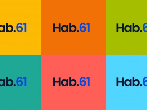
The new visual identity of ‘Habitación 61’ incorporates a vibrant color palette that reinforces the idea of diversity and freshness. Each color is associated with a content category, facilitating navigation and quick understanding of the topics covered. The logo has also been updated, opting for a more modern and elegant typography that maintains simplicity while providing a renewed character. The integration of circles as a graphic element reinforces the connection with the community and the exchange of ideas.

An abbreviated version for greater adaptability
The choice of colors in the new ‘Habitación 61’ image focuses on bright, contrasting tones, such as deep blue, bright green, and warm yellow, which not only differentiate the categories but also convey energy and renewal. The sans-serif typography used in the new identity is more stylized and legible, reflecting the blog’s focus on content clarity and access to practical information. This combination of elements provides a digital, modern, and professional image that invites readers to explore every corner of the blog.

Other Graphic Designs