Brand development, naming, and branding for Libertad24 apartments
Graphic designA brand that connects with its environment: urban, cultural, and steeped in history.
Client: Libertad 24
Province: Madrid
Year: 2025
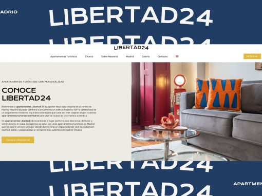
Located in the heart of the Chueca neighborhood, the Libertad24 apartments represent the perfect blend of contemporary design, urban comfort, and the vibrant character of one of Madrid’s most iconic areas. Every corner of the building exudes calm, natural light, and functional elegance designed to offer a warm and modern experience for urban travelers who are curious about their surroundings. The spaces convey order, style, and a welcoming neutrality designed for diverse audiences. This visual proposal builds on that identity to project the brand outward with a graphic design that adapts to its environment: urban, cultural, and steeped in history.
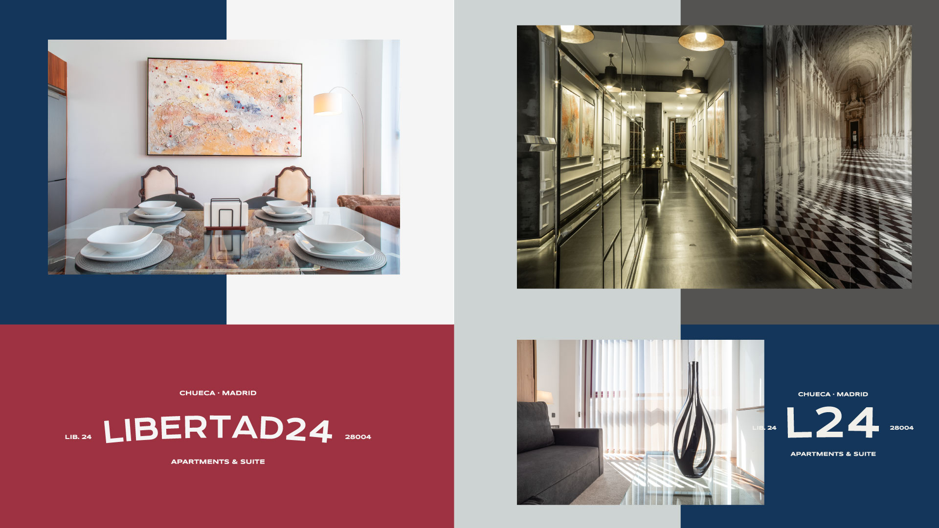
Libertad24: Chueca in the 80s, attitude in the present
This proposal is based on the Krona One typeface, reinterpreted with an arc that adds dynamism and a human touch to the whole. It is a neutral, solid, and elegant version, designed to endure over time and adapt easily to any application: from a plaque at the entrance to social media or the website. The visual play of the curvature gives it a distinctive character without sacrificing the simplicity and clean lines that define the Libertad24 interiors.
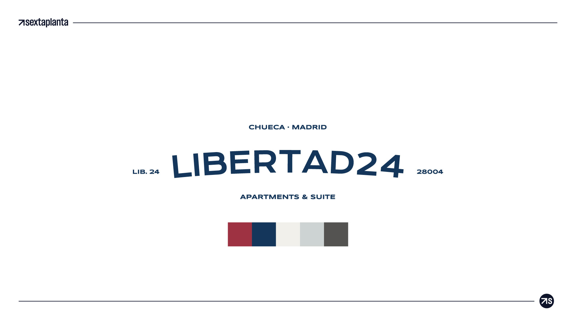
A unique, bold brand with a Madrid soul.
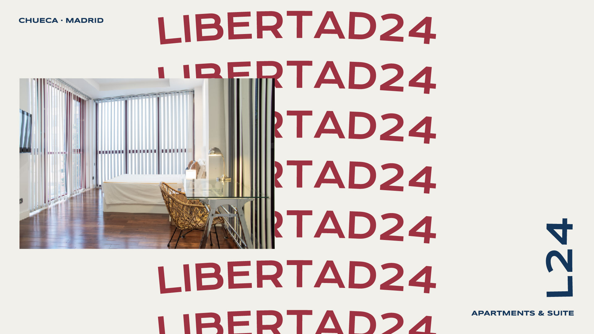
A vibrant and colorful display typeface has been used, inspired by the signs, neon lights, and cultural posters of the 1980s, with a palette that directly references nightlife, alternative culture, and the joy of Madrid’s most rebellious spirit. The design remains modular and adaptable, but adds an iconic personality that connects with creative, curious travelers who love local style. Perfect if we want to position the brand as unique, bold, and with a Madrid soul.
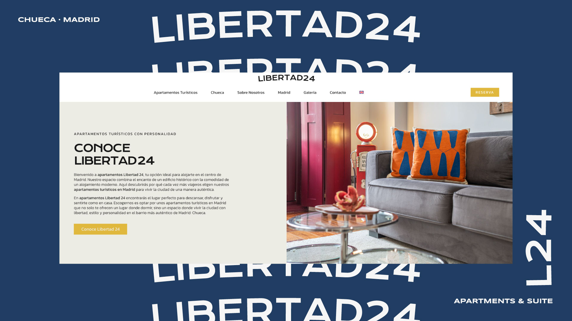
Other Graphic Designs