Suncity Apartamentos Brand Development
Graphic designInspired by the sunrise to convey vitality
Client: Apartamentos Suncity
Province: Málaga
Year: 2019
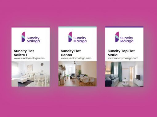
The design of the ‘Suncity Málaga’ brand is inspired by the vibrant energy of the sun rising over the Mediterranean. The image of the rising sun symbolizes the awakening of the city and the beginning of new experiences for visitors. The vivid colors and composition of the logo reflect the dynamic and welcoming spirit of the urban tourist apartments, inviting guests to enjoy the vitality that characterizes the city of Málaga.

Shapes and colors that reflect energy and movement
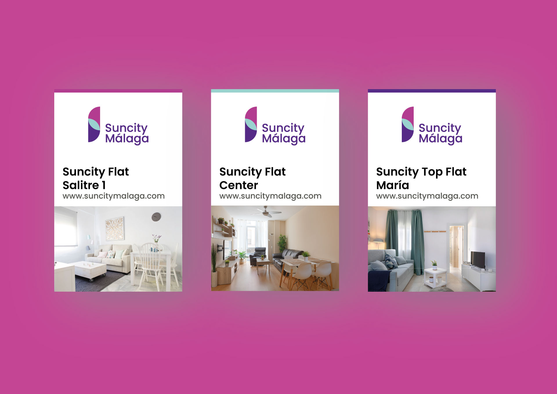
The visual identity of ‘Suncity Málaga’ stands out for its use of stylized geometric shapes that represent sunlight and the movement of sunrise. The composition plays with the overlapping of vibrant tones, creating a dynamic and contemporary symbol that evokes the idea of energy and renewal. This visual identity aims to convey an urban and modern lifestyle, connecting with the active and cosmopolitan essence of the city of Málaga.

Purple and sky blue that evoke freshness and optimism
The color palette of ‘Suncity Málaga’ uses purple and fuchsia tones, which represent the transition of sunrise from darkness to light, symbolizing optimism and renewal. The sky blue color adds a touch of freshness, evoking the clear sky of Málaga. The typography is modern and clear, designed to be accessible and attractive to an urban audience. The combination of colors and typography seeks to convey a fresh, young, and vibrant image, aligned with the concept of urban tourist apartments in a city full of life.

Other Graphic Designs