Cortijo San Isidro Brand Development
Graphic DesignA design that connects with nature and authenticity
Province: Málaga
Year: 2024
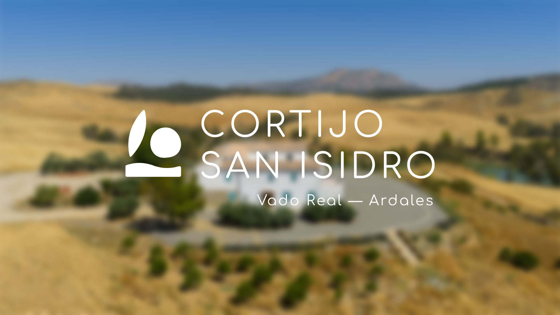
The brand design for Cortijo San Isidro is inspired by nature, featuring organic colors and shapes that evoke the tranquility of the countryside and rural tradition. The brand is built upon a series of symbols that encapsulate the values and essence of the place. Each icon represents a key concept: the moon symbolizes the hospitality and serenity of nights at the cortijo; the sun, unique experiences under the country light; the olive leaf, the connection with nature; the hill, the traditional agriculture of the region; and the river line, the natural environment framing this peaceful space. These elements combine to convey a simple visual identity deeply connected to its surroundings.

Simplicity and rural connection reflected in every stroke
The brand design for Cortijo San Isidro is inspired by simplicity and a deep connection with nature and rural life. Every stroke and every symbol—from the moon to the olive leaf—reflects the values of hospitality, serenity, and authenticity that characterize the cortijo. This visual identity, with a soft color palette and organic shapes, seeks to convey a genuine experience of connection with the rural environment.

Cortijo San Isidro: where tradition meets modern design
Cortijo San Isidro’s visual identity aims to merge tradition and modernity. Inspired by the nature and essence of the Andalusian countryside, each brand symbol reflects an aspect of rural life: the sun, the moon, agriculture, and the landscape. This approach is combined with a clean, modern design that uses simple lines and a soft color palette, creating a brand that honors its traditional roots while projecting into the future with a contemporary style.


Other Graphic Designs