by Sextaplanta | Agencia Digital de Turismo | Jul 7, 2026
A website that digitizes a premium concept under a superb brand
Client: Luxury Singular
Province: La Coruña
Year: 2025
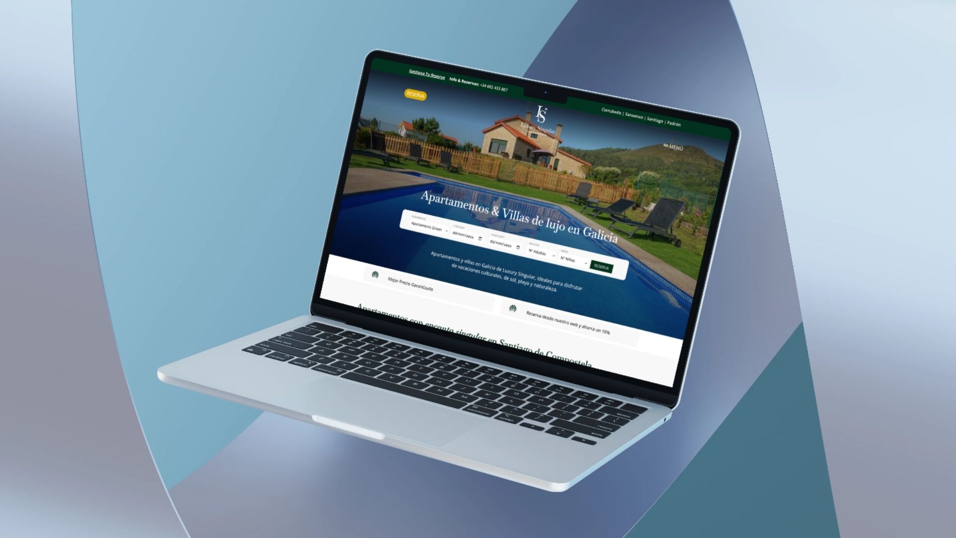
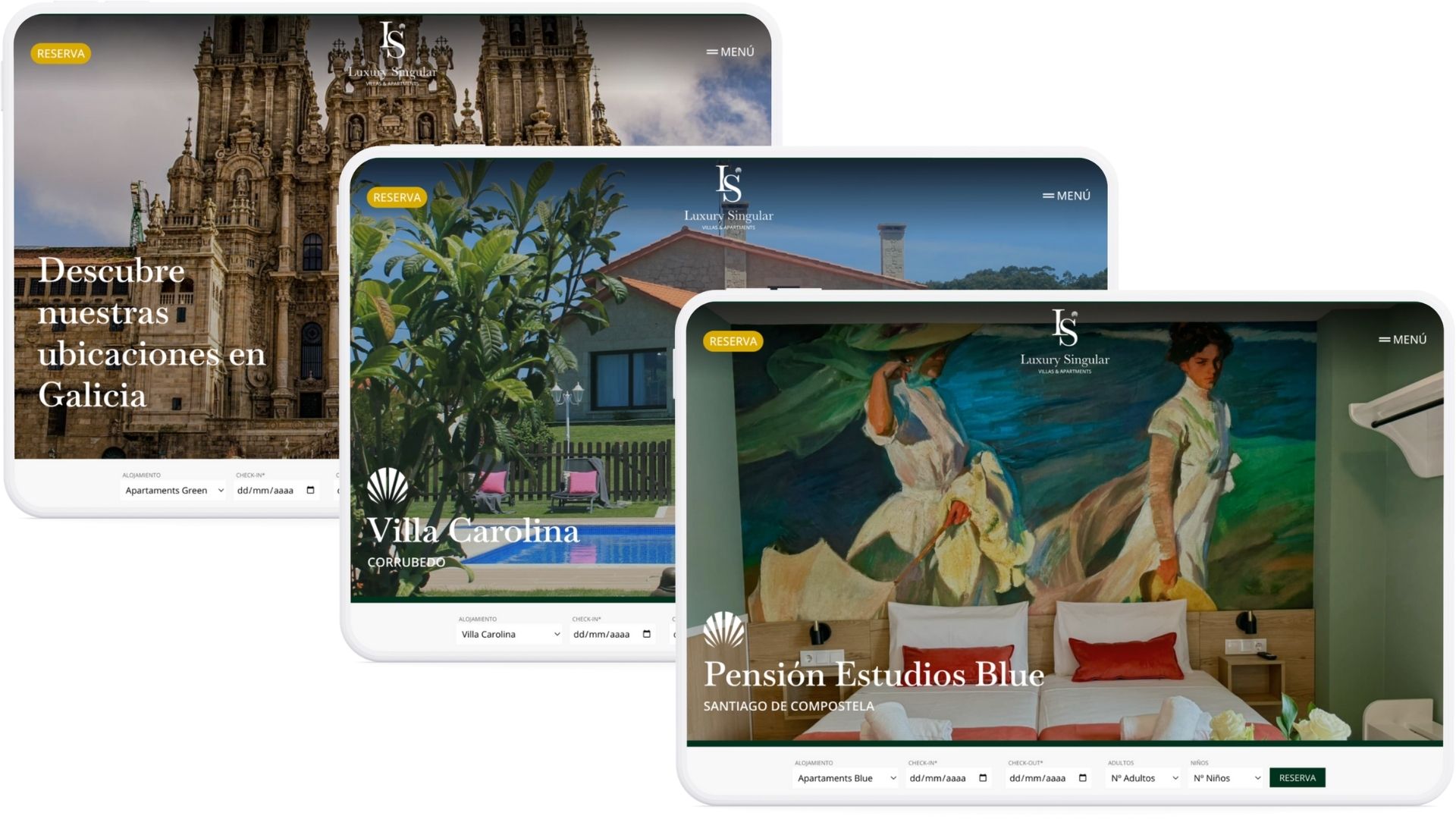
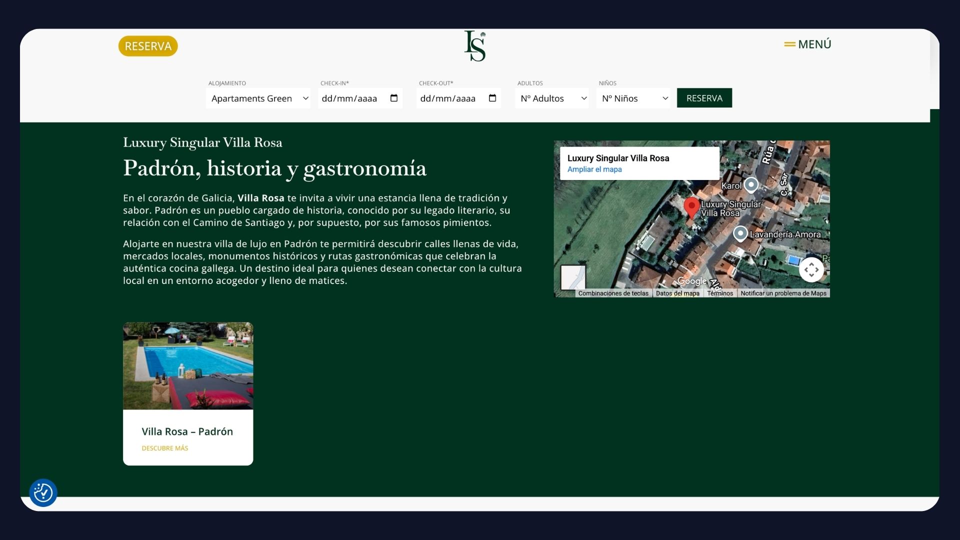
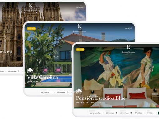
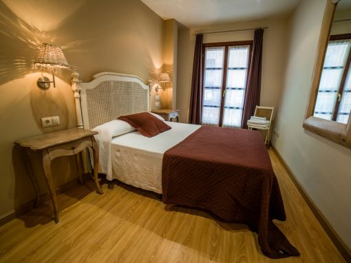
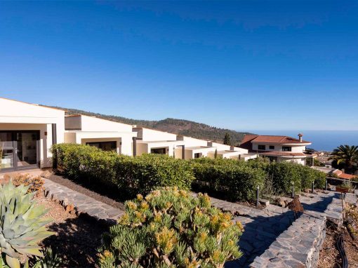
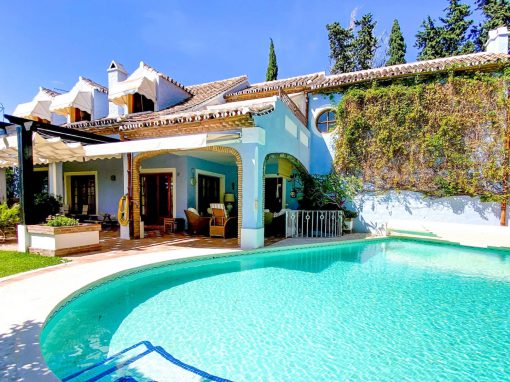
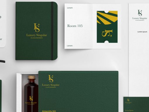
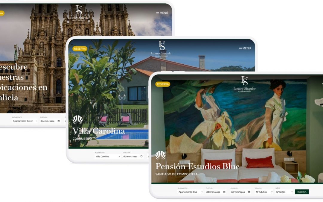
The Luxury Singular website brings a proposal of luxury and comfort tourist accommodations in Galicia to the digital environment, built on the visual identity developed by Sextaplanta. The site presents an orderly and balanced collection of boutique apartments and exclusive villas in Santiago de Compostela, Padrón, Portonovo, and Corrubedo, designed for those seeking unique experiences on the Camino de Santiago and the Rías. The content architecture facilitates the exploration of the accommodations, connecting the brand’s visual universe with the user experience and reinforcing the premium value proposition that distinguishes the project.
Intuitive information architecture for multiple accommodations and experiences
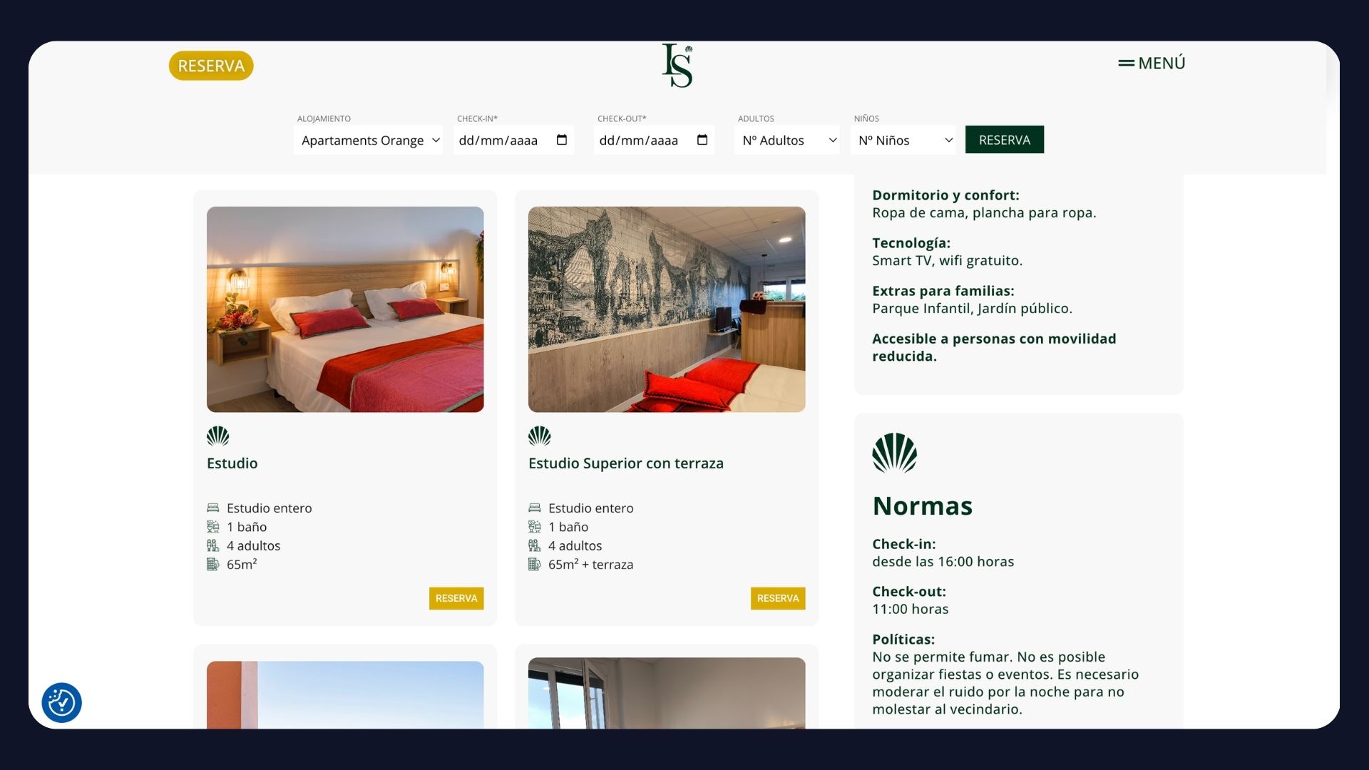
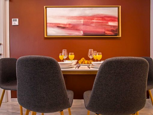
The web development clearly structured the different types of accommodation—Orange, Green, and Blue Apartments in Santiago and unique villas in coastal and rural settings—highlighting their features, locations, and comfort. The navigation allows users to switch between urban apartments and exclusive villas without losing visual or contextual consistency. Additionally, sections for experiences and locations were integrated to enrich the tourism offering and help inspire stays in Galicia. This strategic information architecture facilitates conversion and improves the user journey across all screens.
Optimization for direct booking and promotion of exclusive stays
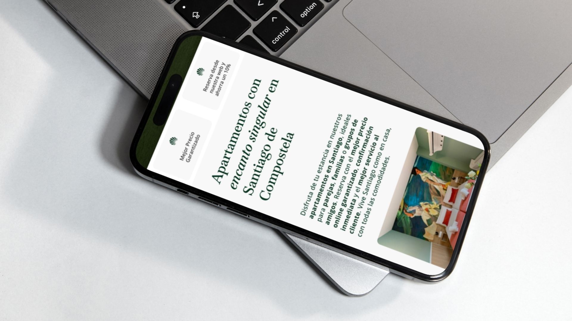
The Luxury Singular website was developed with a clear focus on direct booking conversion, integrating the KrossBooking booking engine in a way that is consistent with the site’s visual and navigation experience. This integration allows users to check availability and prices quickly without leaving the brand environment. The mobile-first design, along with well-positioned calls to action, facilitates an intuitive and efficient booking process. The entire system is designed to reinforce the perception of exclusivity and comfort while maximizing the profitability of the direct channel for a luxury product.
Other Web Design Projects
by Sextaplanta | Agencia Digital de Turismo | Jul 7, 2026
A brand that connects with innovation and tourism.
Client: Turismo Andaluz
Province: Málaga
Year: 2024
The Andalucía NEXUS brand was created with the objective of providing a cohesive representation of the tourism innovation ecosystem promoted by the Regional Government of Andalusia. The challenge consisted of developing a distinctive naming strategy and a versatile visual identity that could be deployed across the various verticals that make up this knowledge hub: data, talent, lab, future, and audiences. At Sextaplanta, we proposed the name ‘NEXUS’ as an alternative to ‘Hub’, seeking a word that better reflected the essence of connection, networking, and professional community without generating potential misconceptions. The graphic proposal enhances clarity, modular structure, and adaptation to different institutional and sectoral contexts.
A modular visual system that adds value and identifies each initiative
The visual identity of Andalucía NEXUS is articulated through the “+” symbol, a graphic resource that conveys the idea of adding, expanding, and connecting. This symbol functions as the backbone of a modular system that allows for the integration of distinct verticals—such as +data, +talent, or +lab—while maintaining consistency with the parent brand. Each vertical has its own color and personality, facilitating immediate recognition and providing each line of work with a solid identity aligned with the values of the NEXUS ecosystem. The result is a flexible, clear brand architecture prepared for growth.
A brand prepared to project Andalusia into the digital world
The Andalucía NEXUS graphic system has been designed to easily adapt to multiple formats and environments: from physical signage to web environments, social media, institutional presentations, or interactive applications. Its clean and modular style favors coexistence with other brands in the Andalusian tourism ecosystem, reinforcing its institutional role without losing its own identity. The digital, modern, and innovative character of this brand is also a statement of intent: to position Andalusia as an international benchmark in the development of technological solutions for the tourism of the future.
by Sextaplanta | Agencia Digital de Turismo | Jul 7, 2026
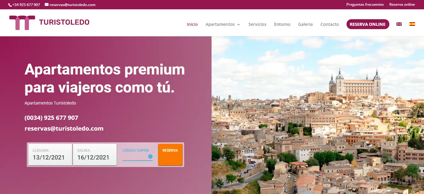
Web design with booking engine for Turistoledo Apartments
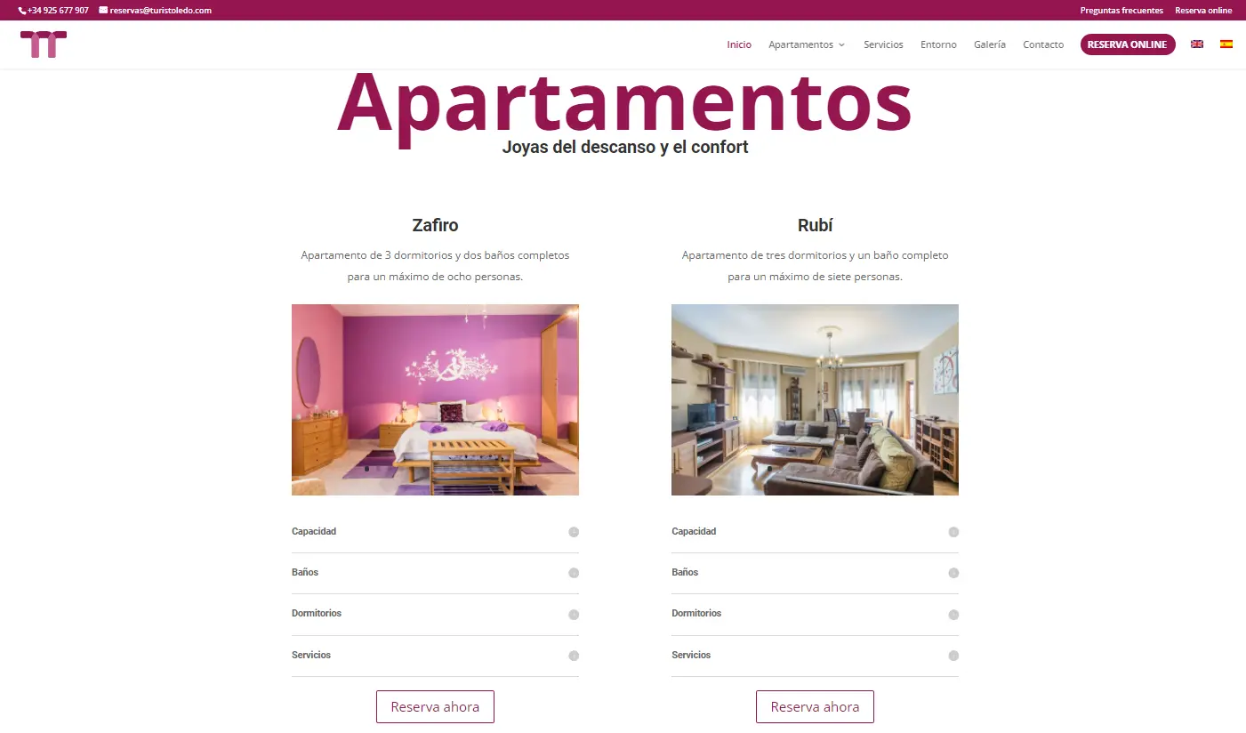
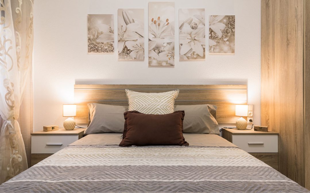
Turistoledo Apartments are a set of 4 units located in the same building in a prime location in the centre of Toledo. The accommodation offers first-class comfort in 4 unique apartments, each differentiated by its services and amenities.
To ensure users had detailed information about what each one offered, a consistent web design was created, but differentiated by the logo colour, which is different on each accommodation listing, as each one offers a unique experience.
The website has been developed in two languages and integrated with the Wubook booking engine, giving prominence both to simple content navigation and access to the booking engine.
The end result is a very elegant and attractive website that allows any user to access the content easily, both on mobile and desktop.
by Sextaplanta | Agencia Digital de Turismo | Jul 7, 2026
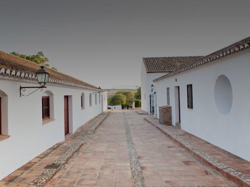
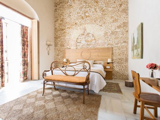
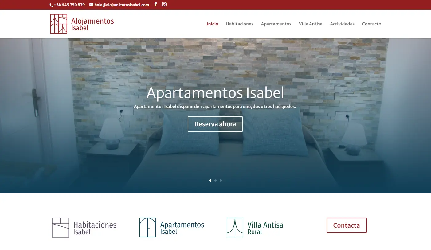
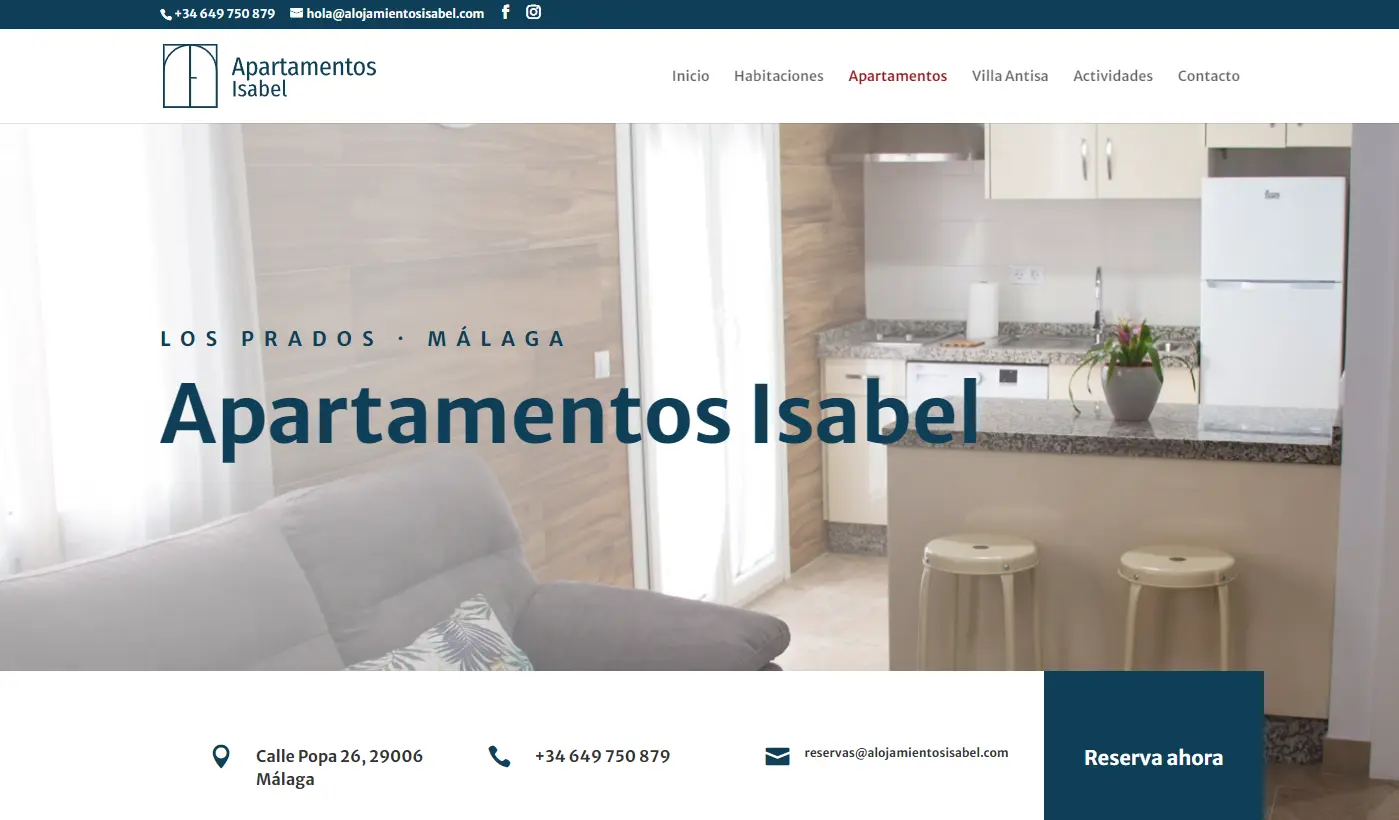
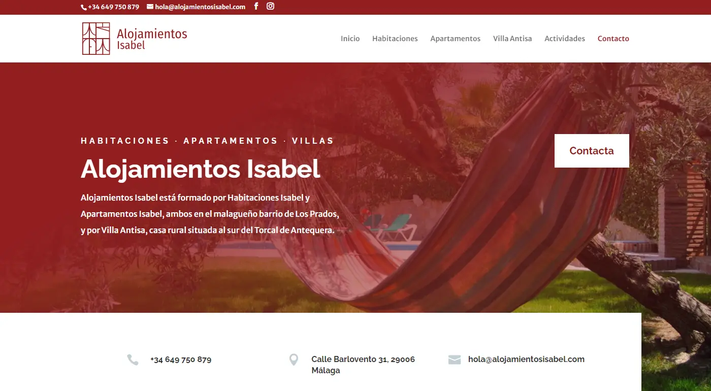
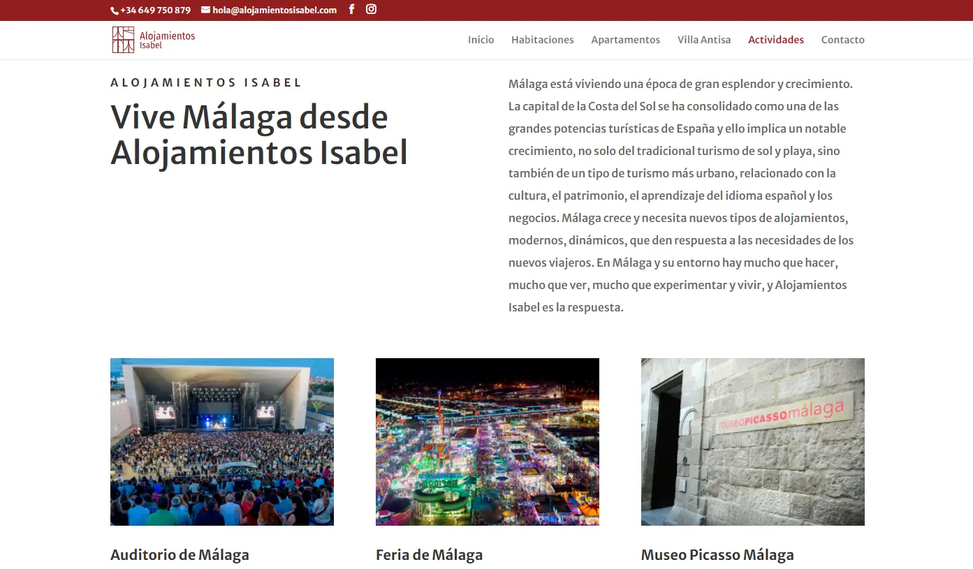
Alojamientos Isabel Web Design
Alojamientos Isabel is a family business whose second generation sought to professionalize its promotion by creating a group of different types of accommodations.
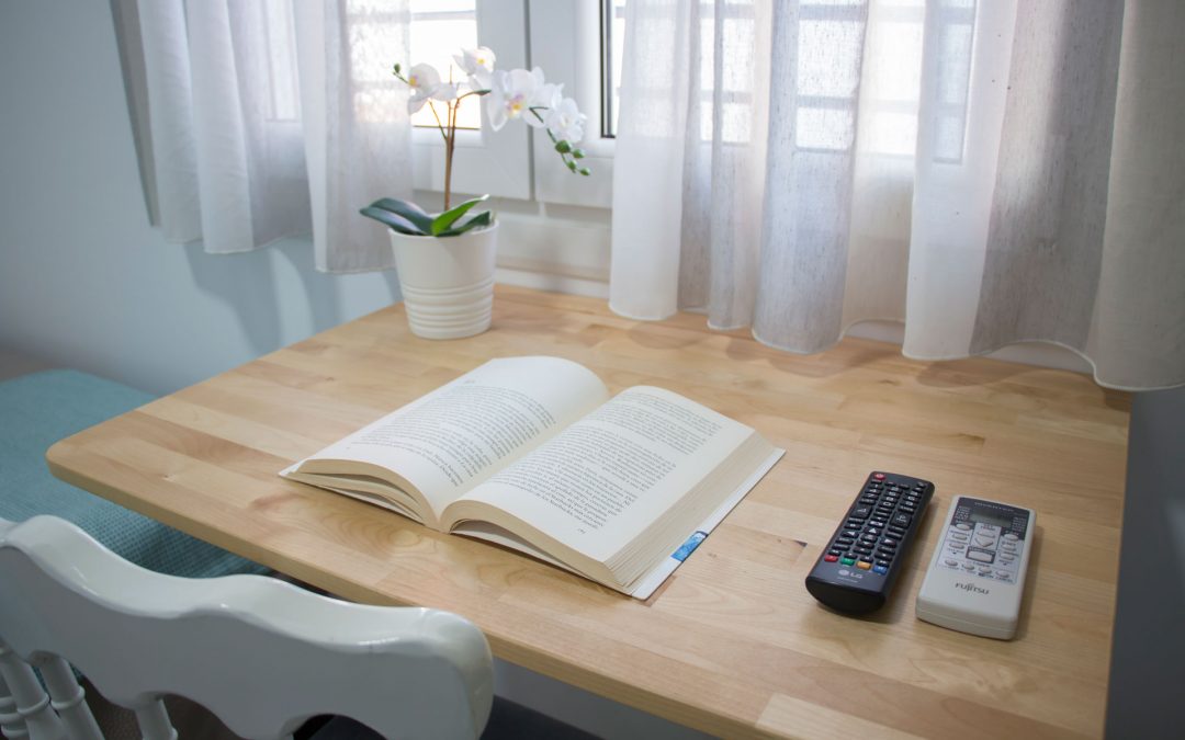
For this purpose, a web platform was developed to house differentiated sections for a guesthouse, tourist apartments, and a rural house.
The developed solution is a platform with different environments, differentiated by complementary brands and distinct color schemes. This provides a sense of uniformity to the user while also making it clear that each accommodation is independent.
The complete project was a significant challenge, where every detail was meticulously cared for to ensure an optimal user experience.
Website: www.alojamientosisabel.com
by Sextaplanta | Agencia Digital de Turismo | Jul 7, 2026
Calm and authenticity inspired by the Mediterranean breeze
Client: Cortijo San Isidro
Province: Málaga
Year: 2023
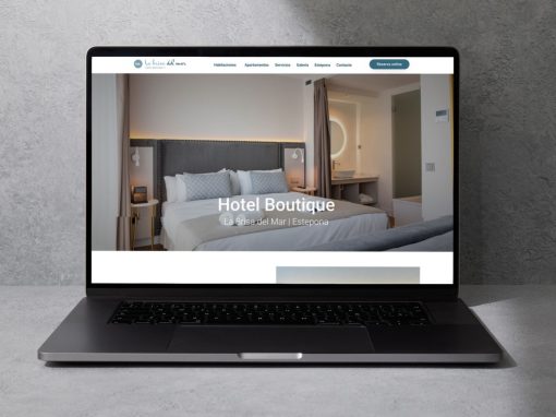
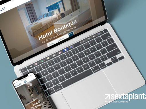
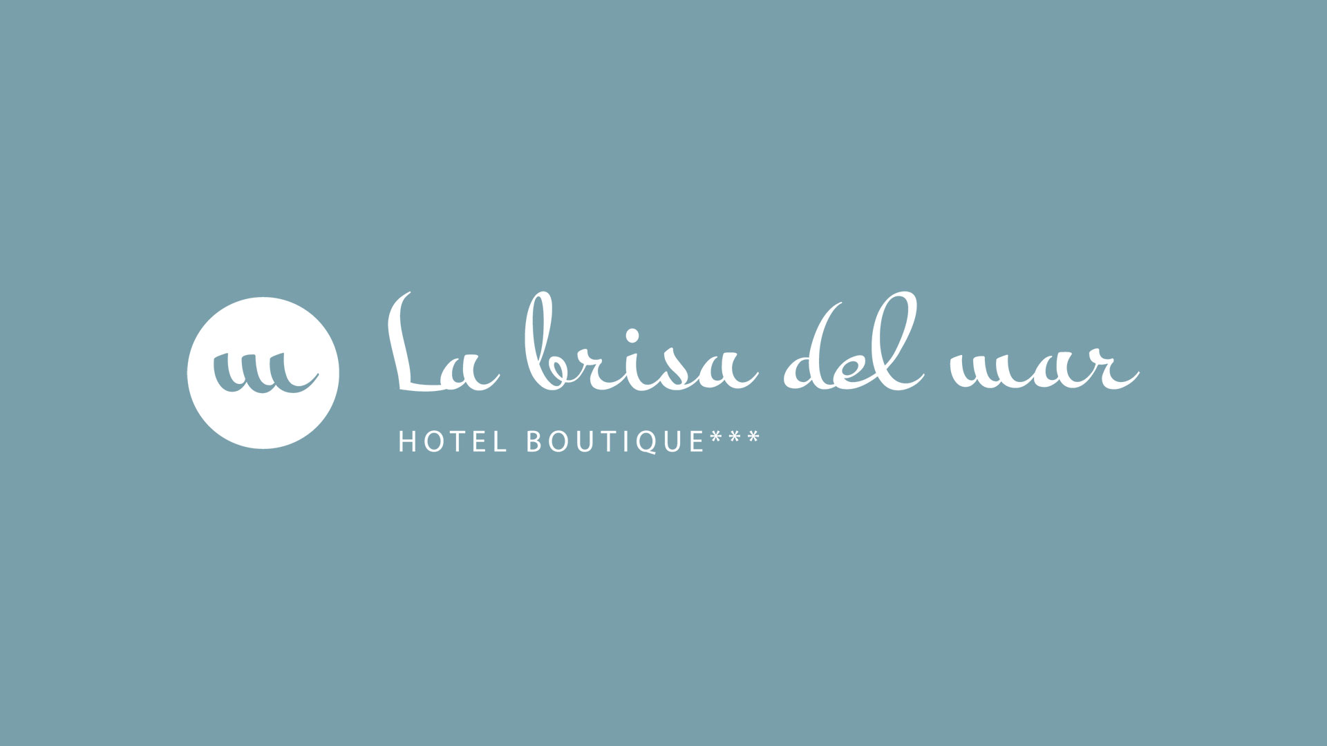
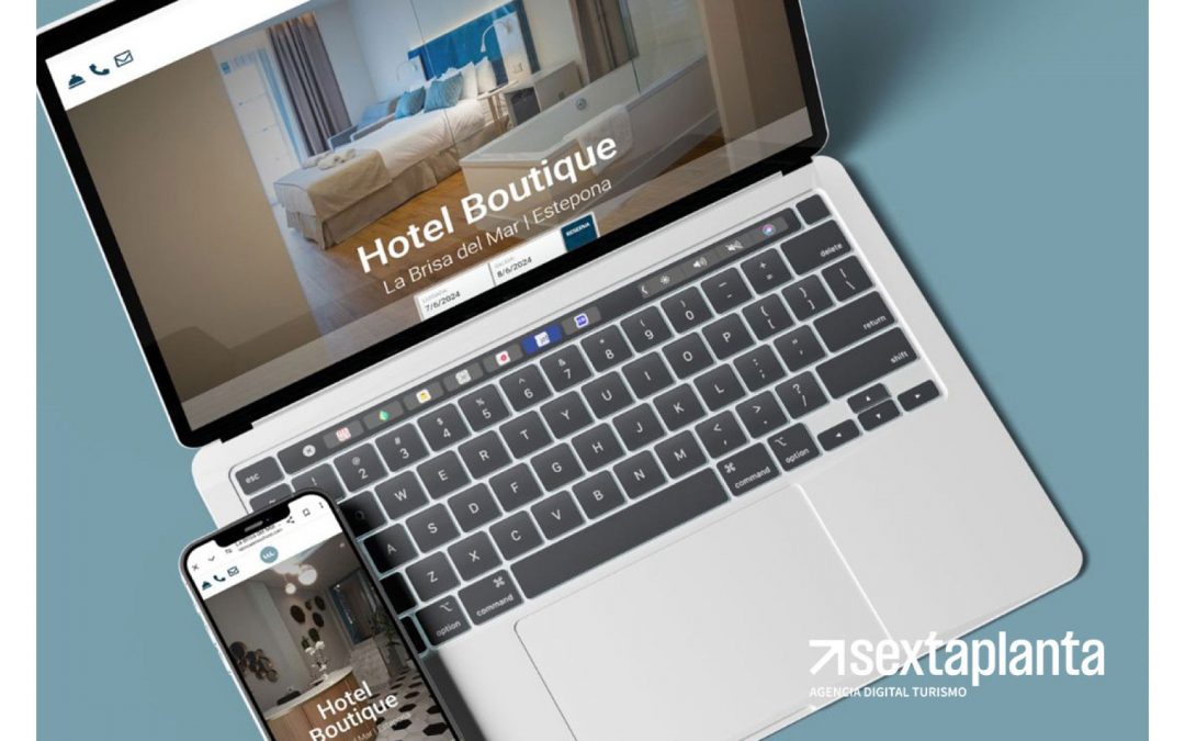
The ‘La Brisa del Mar’ brand is inspired by the relaxed atmosphere and freshness of Estepona’s Mediterranean coast. The choice of name and visual elements aims to evoke the feeling of being near the sea, enjoying the breeze and the calm offered by a small, family-run hotel. The design conveys the authenticity of a cozy seaside experience, ideal for those seeking a retreat with a personal and homey touch.
A visual identity reflecting freshness and warmth
The visual identity of ‘La Brisa del Mar’ combines a calligraphic logo that simulates the gentle movement of the sea breeze with a circular symbol that encapsulates the essence of the sea. The fluid, handcrafted typography reinforces the hotel’s family-oriented and welcoming character, conveying warmth and proximity. The graphic elements are designed to evoke the simplicity and authenticity of a relaxing stay in a coastal setting.
Coastal tones and fluid lettering that invite relaxation
The ‘La Brisa del Mar’ color palette is based on blue and gray tones that evoke the sea and the sky, reflecting the freshness of Estepona’s coastal environment. The typography used in the logo is calligraphic and elegant, reinforcing the boutique character and attention to detail that defines the hotel. Every brand design decision is intended to convey a unique experience, where tranquility and family comfort take center stage.