by Sextaplanta | Agencia Digital de Turismo | Jul 7, 2026
A brand that connects with innovation and tourism.
Client: Turismo Andaluz
Province: Málaga
Year: 2024
The Andalucía NEXUS brand was created with the objective of providing a cohesive representation of the tourism innovation ecosystem promoted by the Regional Government of Andalusia. The challenge consisted of developing a distinctive naming strategy and a versatile visual identity that could be deployed across the various verticals that make up this knowledge hub: data, talent, lab, future, and audiences. At Sextaplanta, we proposed the name ‘NEXUS’ as an alternative to ‘Hub’, seeking a word that better reflected the essence of connection, networking, and professional community without generating potential misconceptions. The graphic proposal enhances clarity, modular structure, and adaptation to different institutional and sectoral contexts.
A modular visual system that adds value and identifies each initiative
The visual identity of Andalucía NEXUS is articulated through the “+” symbol, a graphic resource that conveys the idea of adding, expanding, and connecting. This symbol functions as the backbone of a modular system that allows for the integration of distinct verticals—such as +data, +talent, or +lab—while maintaining consistency with the parent brand. Each vertical has its own color and personality, facilitating immediate recognition and providing each line of work with a solid identity aligned with the values of the NEXUS ecosystem. The result is a flexible, clear brand architecture prepared for growth.
A brand prepared to project Andalusia into the digital world
The Andalucía NEXUS graphic system has been designed to easily adapt to multiple formats and environments: from physical signage to web environments, social media, institutional presentations, or interactive applications. Its clean and modular style favors coexistence with other brands in the Andalusian tourism ecosystem, reinforcing its institutional role without losing its own identity. The digital, modern, and innovative character of this brand is also a statement of intent: to position Andalusia as an international benchmark in the development of technological solutions for the tourism of the future.
by Sextaplanta | Agencia Digital de Turismo | Jul 7, 2026
Calm and authenticity inspired by the Mediterranean breeze
Client: Cortijo San Isidro
Province: Málaga
Year: 2023
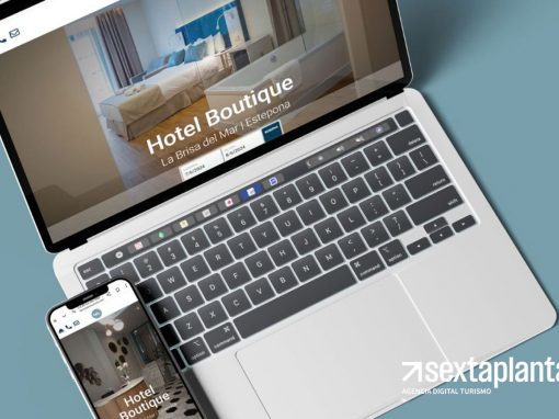
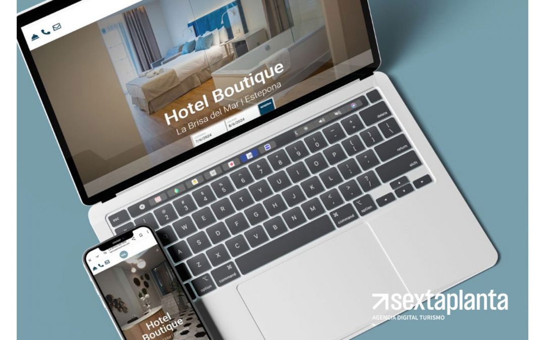
The ‘La Brisa del Mar’ brand is inspired by the relaxed atmosphere and freshness of Estepona’s Mediterranean coast. The choice of name and visual elements aims to evoke the feeling of being near the sea, enjoying the breeze and the calm offered by a small, family-run hotel. The design conveys the authenticity of a cozy seaside experience, ideal for those seeking a retreat with a personal and homey touch.
A visual identity reflecting freshness and warmth
The visual identity of ‘La Brisa del Mar’ combines a calligraphic logo that simulates the gentle movement of the sea breeze with a circular symbol that encapsulates the essence of the sea. The fluid, handcrafted typography reinforces the hotel’s family-oriented and welcoming character, conveying warmth and proximity. The graphic elements are designed to evoke the simplicity and authenticity of a relaxing stay in a coastal setting.
Coastal tones and fluid lettering that invite relaxation
The ‘La Brisa del Mar’ color palette is based on blue and gray tones that evoke the sea and the sky, reflecting the freshness of Estepona’s coastal environment. The typography used in the logo is calligraphic and elegant, reinforcing the boutique character and attention to detail that defines the hotel. Every brand design decision is intended to convey a unique experience, where tranquility and family comfort take center stage.
by Sextaplanta | Agencia Digital de Turismo | Jul 7, 2026
A brand that connects with its environment: urban, cultural, and steeped in history.
Client: Libertad 24
Province: Madrid
Year: 2025
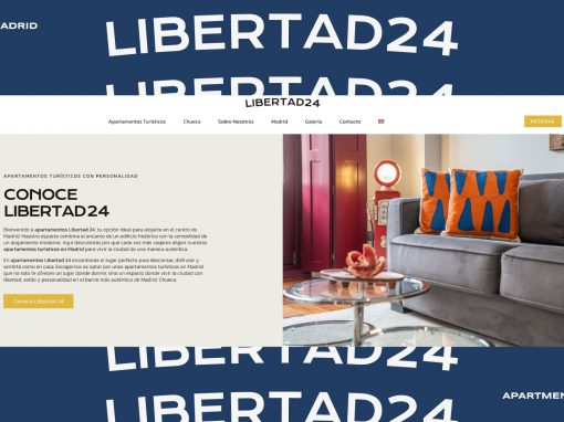
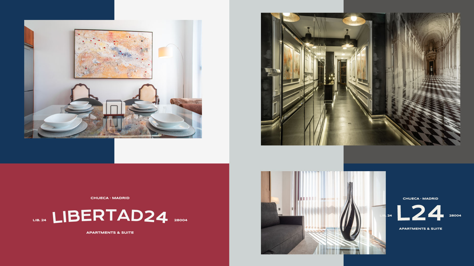
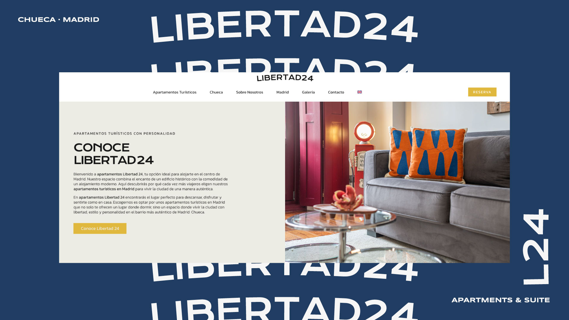
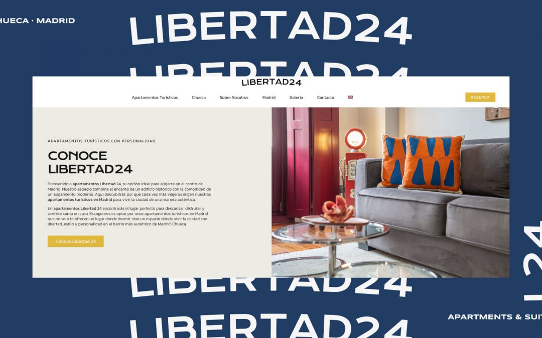
Located in the heart of the Chueca neighborhood, the Libertad24 apartments represent the perfect blend of contemporary design, urban comfort, and the vibrant character of one of Madrid’s most iconic areas. Every corner of the building exudes calm, natural light, and functional elegance designed to offer a warm and modern experience for urban travelers who are curious about their surroundings. The spaces convey order, style, and a welcoming neutrality designed for diverse audiences. This visual proposal builds on that identity to project the brand outward with a graphic design that adapts to its environment: urban, cultural, and steeped in history.
Libertad24: Chueca in the 80s, attitude in the present
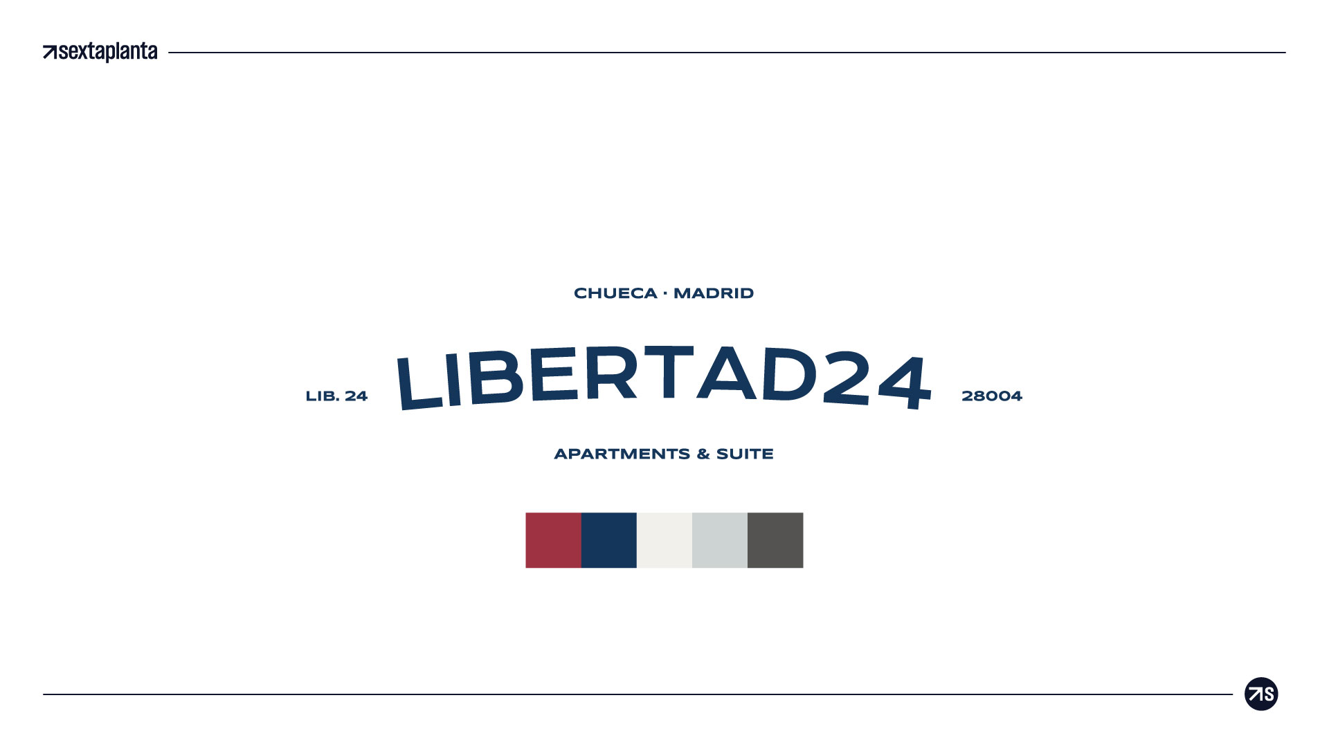
This proposal is based on the Krona One typeface, reinterpreted with an arc that adds dynamism and a human touch to the whole. It is a neutral, solid, and elegant version, designed to endure over time and adapt easily to any application: from a plaque at the entrance to social media or the website. The visual play of the curvature gives it a distinctive character without sacrificing the simplicity and clean lines that define the Libertad24 interiors.
A unique, bold brand with a Madrid soul.
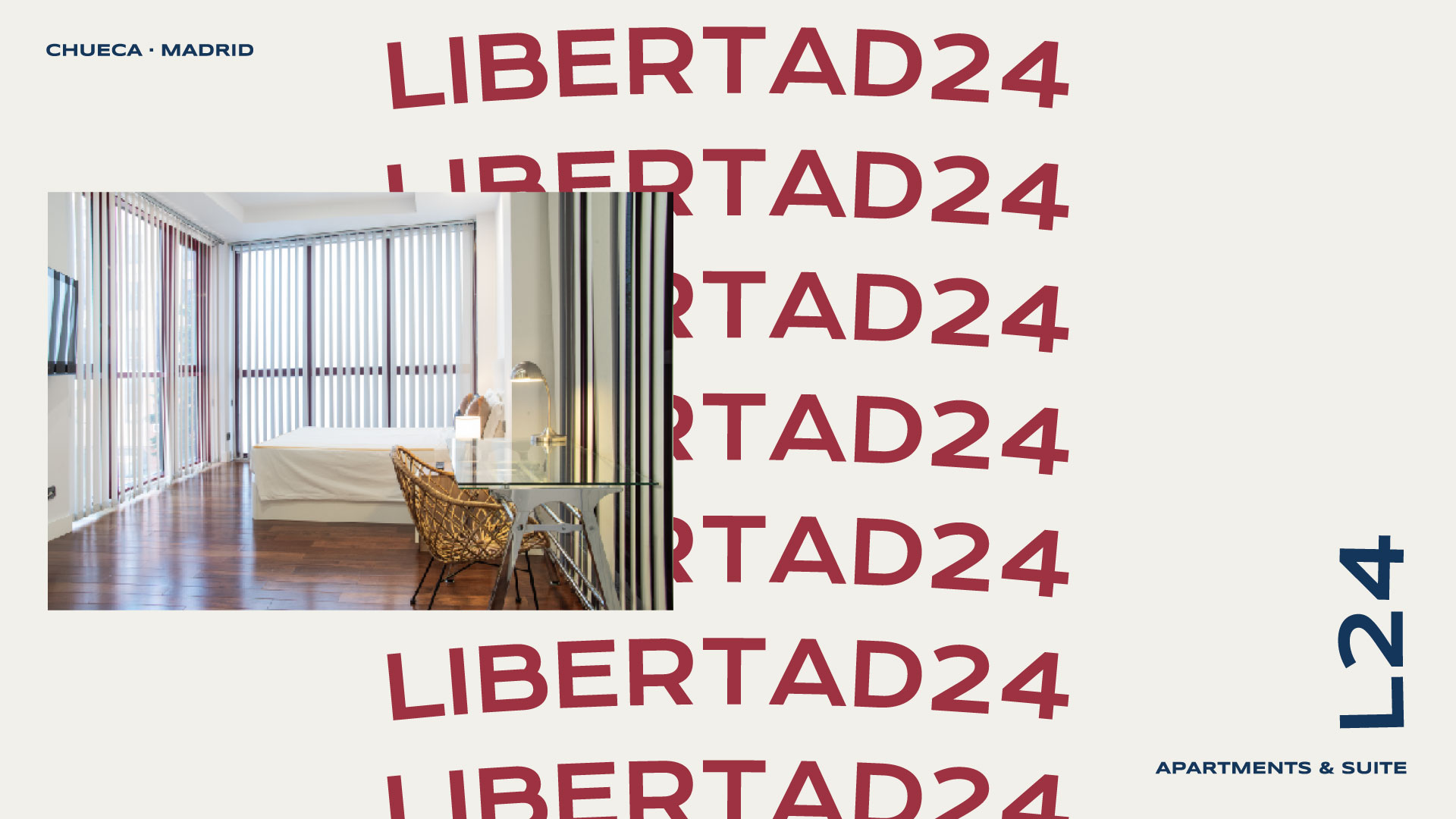
A vibrant and colorful display typeface has been used, inspired by the signs, neon lights, and cultural posters of the 1980s, with a palette that directly references nightlife, alternative culture, and the joy of Madrid’s most rebellious spirit. The design remains modular and adaptable, but adds an iconic personality that connects with creative, curious travelers who love local style. Perfect if we want to position the brand as unique, bold, and with a Madrid soul.
by Sextaplanta | Agencia Digital de Turismo | Jul 7, 2026
A brand that elevates luxury identity from its roots
Client: Luxury Singular
Province: A Coruña
Year: 2025
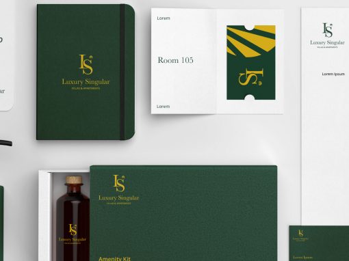
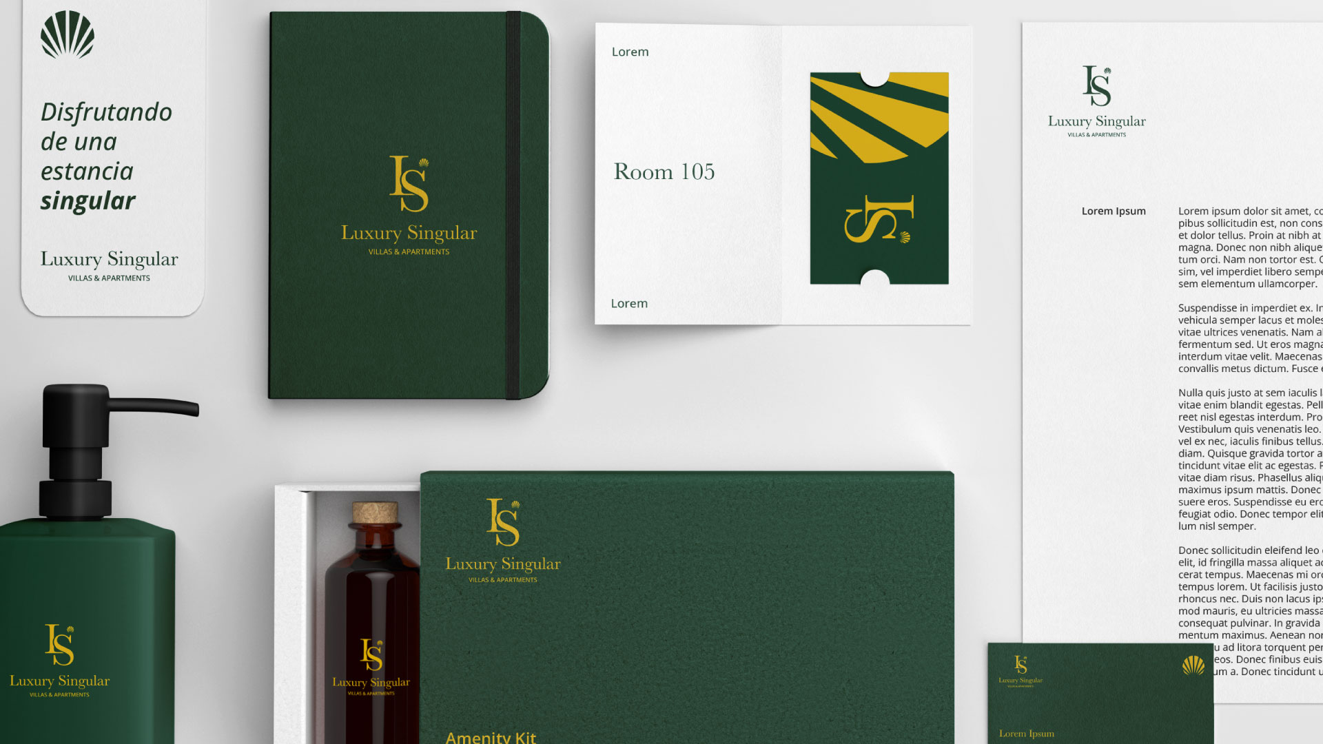
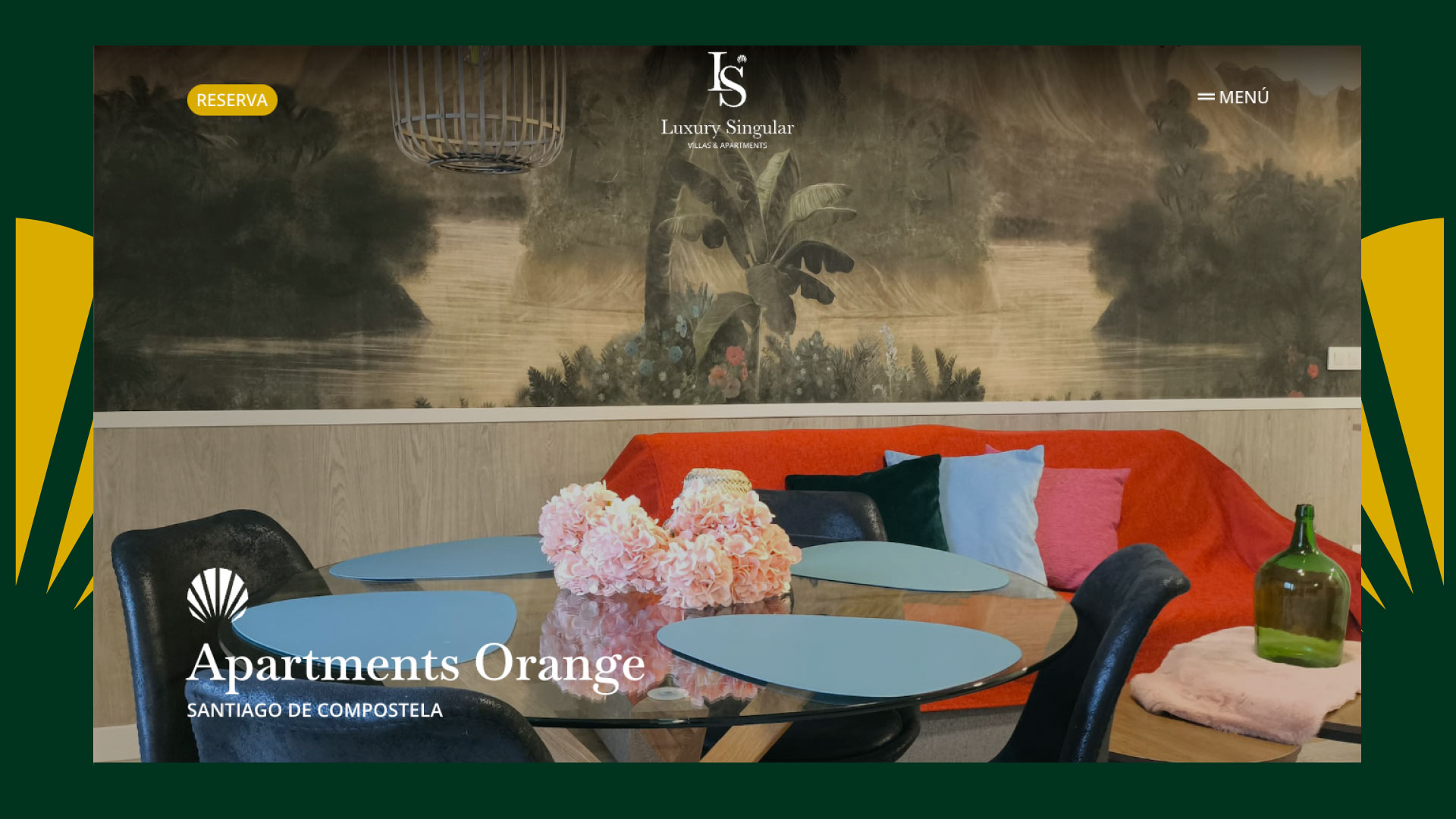
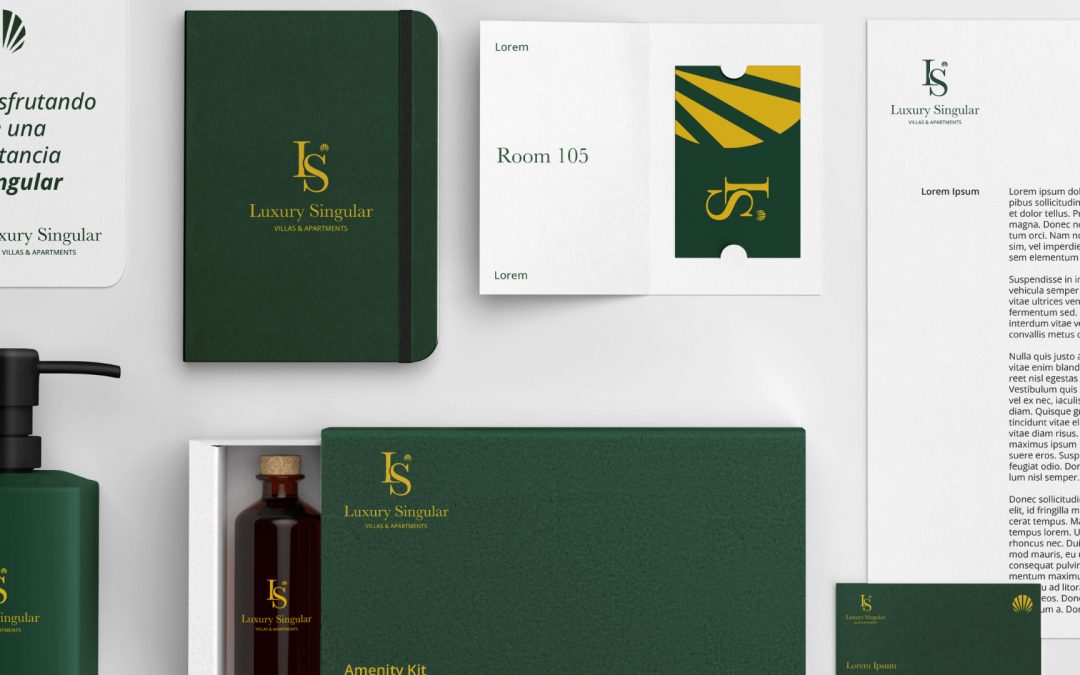
Luxury Singular is built on a symbol that combines exclusivity, elegance, and a clear dedication to detail. The development of the monogram, formed by the initials L and S, is rooted in the tradition of the great luxury houses, which have used this device throughout history to convey solidity and prestige. Our challenge was to create an emblem that projected this premium universe without losing the brand’s authenticity.
The result is a sober, balanced monogram with direct references to the imagery of contemporary luxury, capable of becoming a distinctive seal for all the accommodations that are part of Luxury Singular’s offering.
A visual language that connects territory, light, and sophistication
The addition of the shell above the “S” brings deep and distinctive meaning to the visual system. This symbol represents Galicia, its coastline, its heritage, and the iconic Camino de Santiago, where the shell is a historic icon.
Beyond its territorial roots, its shape evokes the light and shimmer of the sea—an attribute that connects directly with the exclusivity and unique character of Luxury Singular accommodations.
This graphic gesture introduces an organic, warm note that coexists with the monogram’s precision, creating a sophisticated balance that reinforces the brand’s own personality.
A typographic and colour style that defines a premium experience.
The choice of the Baskerville typeface reinforces Luxury Singular’s elegant, timeless essence. This classic 18th-century font, created by British typographer John Baskerville, stands out for its balance between tradition and modernity, bringing refinement and impeccable readability across all media.
This system is complemented by a black-and-white palette—an iconic combination in the world of luxury for its ability to convey sobriety, exclusivity, and versatility. This chromatic pairing ensures a strong, adaptable, and coherent identity, ready to perform both in digital applications and in physical environments.
The result is a brand that breathes contemporary elegance, aligned with premium values and with a vocation to endure over time.
by Sextaplanta | Agencia Digital de Turismo | Jul 7, 2026
Digital branding with a family essence
Client: Alojamientos Isabel
Province: Málaga
Year: 2018
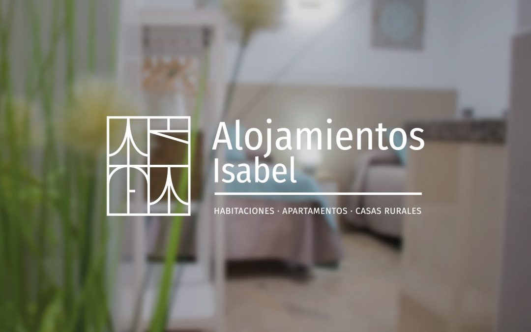
When we met the family business behind Alojamientos Isabel, we discovered a project undergoing a complete transformation. After a long and successful history of bringing their services closer to their clients, the company needed to bring its product to the internet, and for this, it required a complete rebranding of its image. The Alojamientos Isabel branding project maintained the essence of the proper name in the naming but incorporated new visual elements to highlight its entire accommodation offering.
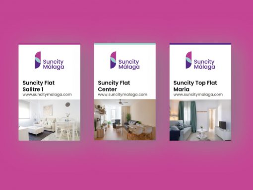
Alojamientos Isabel offers three distinct tourist accommodation options, all sharing a common denominator: a family-like approach. For this reason, we needed to create a set of related brands for each product that would still form part of a unified whole, thus facilitating a consistent message for the public and ensuring all products complemented each other within a varied tourist offering.
Brand consistency and digital identity.
Every development of a tourist brand requires the creation of a corporate identity that thrives within the digital tourism ecosystem, conveying its unique values. In addition to creating the brand and adapting it to the digital environment, we have planned specific applications for other formats.