by Sextaplanta | Agencia Digital de Turismo | Jul 7, 2026
Inspired by the sunrise to convey vitality
Client: Apartamentos Suncity
Province: Málaga
Year: 2019
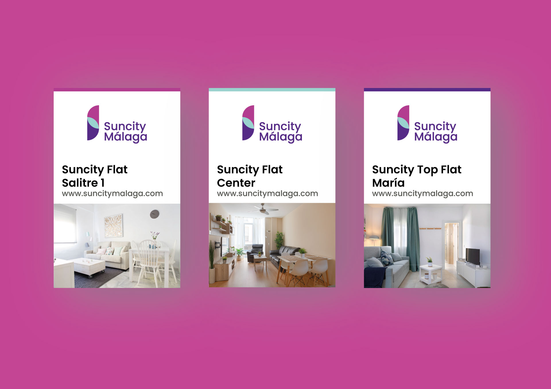
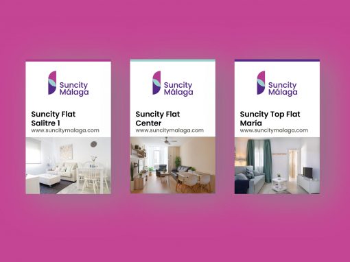
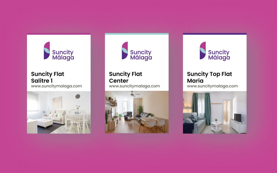
The design of the ‘Suncity Málaga’ brand is inspired by the vibrant energy of the sun rising over the Mediterranean. The image of the rising sun symbolizes the awakening of the city and the beginning of new experiences for visitors. The vivid colors and composition of the logo reflect the dynamic and welcoming spirit of the urban tourist apartments, inviting guests to enjoy the vitality that characterizes the city of Málaga.
Shapes and colors that reflect energy and movement
The visual identity of ‘Suncity Málaga’ stands out for its use of stylized geometric shapes that represent sunlight and the movement of sunrise. The composition plays with the overlapping of vibrant tones, creating a dynamic and contemporary symbol that evokes the idea of energy and renewal. This visual identity aims to convey an urban and modern lifestyle, connecting with the active and cosmopolitan essence of the city of Málaga.
Purple and sky blue that evoke freshness and optimism
The color palette of ‘Suncity Málaga’ uses purple and fuchsia tones, which represent the transition of sunrise from darkness to light, symbolizing optimism and renewal. The sky blue color adds a touch of freshness, evoking the clear sky of Málaga. The typography is modern and clear, designed to be accessible and attractive to an urban audience. The combination of colors and typography seeks to convey a fresh, young, and vibrant image, aligned with the concept of urban tourist apartments in a city full of life.

by Sextaplanta | Agencia Digital de Turismo | Jul 7, 2026
Tradition and modernity united in every detail
Client: Grupo Apartamentos La Puebla
Province: Asturias
Year: 2019
The development of the ‘La Puebla’ brand was based on creating an identity for a multi-product apartment group in Llanes, Asturias, that would reflect both the history and charm of the region. The concept is inspired by traditional architecture and the ornamental details typical of the area, combining tradition with a modern hospitality proposal. Through the naming of each apartment—’El Cordial del Fausto’, ‘Las Fuentes’ and ‘Puerto de Llanes’—local places and references are evoked, seeking to connect visitors with the cultural and natural richness of Asturias.
Symbols that reflect the architecture and cultural legacy
The visual identity of ‘La Puebla’ and its different products seeks to establish a connection between the tourist apartments and the Asturian cultural heritage. Each logo combines a graphic element reminiscent of the ornamental decorations that adorn the building’s balconies, creating a coherent image for each sub-product of the group. The differentiated colors—red, blue and purple—provide each apartment with its own identity, while maintaining visual unity, reinforcing the idea of a cohesive group offering diverse experiences in the same environment.
Deep colors that evoke the Asturian essence
The color palette of ‘La Puebla’ is composed of deep tones that reflect the Asturian environment: red symbolizes warmth and tradition, blue evokes the fountains and the sea, and purple conveys elegance and serenity. The typography used is modern and legible, designed to offer an accessible and welcoming image, maintaining a balance with the sophistication that defines these apartments. The combination of colors and typography reinforces the identity of each apartment as part of a group, maintaining visual consistency and providing each one with a unique character.
by Sextaplanta | Agencia Digital de Turismo | Jul 7, 2026
inspired by the natural and cultural richness of the Dominican Republic
Client: Fundación Cidela / IDDI
Country: Dominican Republic
Year: 2019
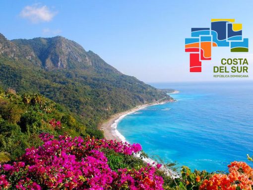
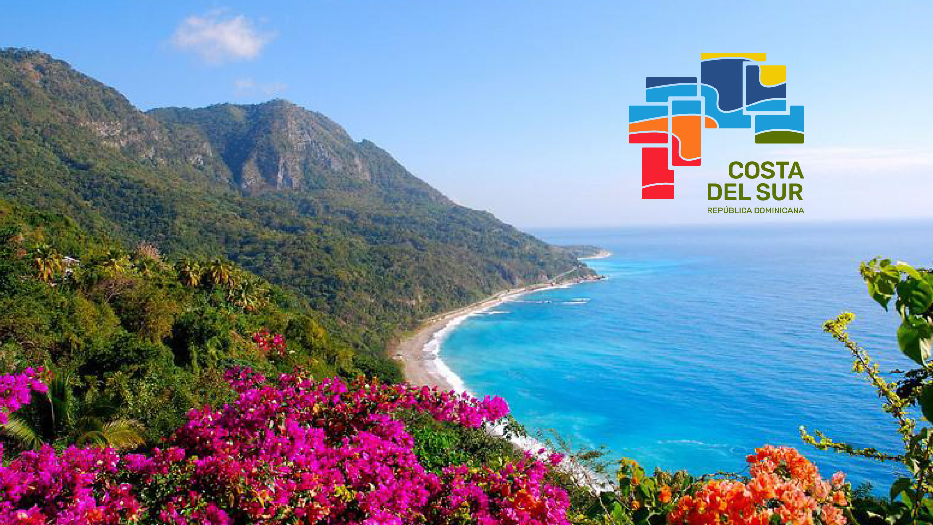
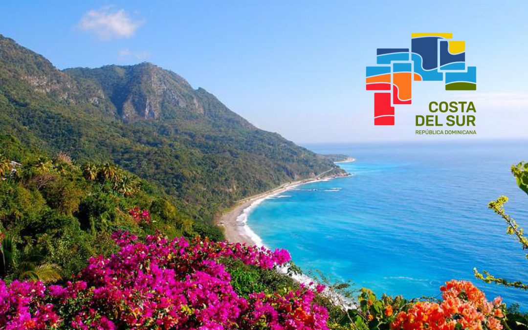
The ‘Costa del Sur’ brand is inspired by the natural and cultural richness of the eight provinces in the southern region of the Dominican Republic. The larimar mineral, a semi-precious stone unique to the country, was used as a reference, combined with the shape of the region’s map, to convey an authentic and representative visual identity. This inspiration brings to life a design that seeks to reflect the diversity and beauty of the destination, integrating the unique characteristics of each province into a harmonious whole that invites visitors to discover the essence of the Dominican coast.
A modular design that integrates and represents
The visual identity of ‘Costa del Sur’ was built from the union of geometric shapes representing each of the eight provinces in the region. The visual elements overlap to reflect the integration and richness of the territory. Each province has a distinctive color, which provides its own identity within the overall brand, while the shape and arrangement of the elements suggest connection and a sense of community. This modular structure allows the brand to be represented both as a unified whole and through each province separately.
Vibrant colors that evoke the beauty of the south
The color palette of ‘Costa del Sur’ is vibrant and diverse, inspired by the variety of landscapes and cultural richness of the region. Warm and cool tones were used to represent the land, sea, sky and sun, evoking the diversity of experiences the destination has to offer. The chosen typography is clear and modern, providing an accessible and dynamic image that complements the visual richness of the logo. This combination of colors and typography ensures that the brand is eye-catching and easily recognizable, conveying the welcoming and multifaceted spirit of Costa del Sur.

by Sextaplanta | Agencia Digital de Turismo | Jul 7, 2026
Design inspired by the essence of the Mediterranean
Client: Torre de la Roca Apartments
Province: Málaga
Year: 2021
The brand creation process for Torre de la Roca Apartments began with a deep connection to the Mediterranean environment and the Andalusian coastal identity. The logo design is inspired by natural elements such as the sea and palm trees, symbolizing both the calm and vitality of the region. The choice of the blue color palette is directly linked to the tranquility of the marine horizon, evoking serenity and well-being. The brand seeks to convey the essence of a relaxing seaside experience, highlighting the accommodation’s connection to its natural surroundings.
Visual design that evokes the Andalusian coastal charm
The development of the visual identity for Torre de la Roca Apartments focused on creating an image that reflected both the tradition and modernity of the coast. The logo combines an organic symbol that evokes the surrounding nature and the emblematic coastal views, with a serif typeface that provides a classic and welcoming feel. This combination reflects the balance between modern comfort and the natural environment that characterizes the apartments, aiming to communicate a visual experience consistent with the serenity and elegance offered by the accommodation.
Serene blues and elegant typography to convey tranquility
The color palette of Torre de la Roca Apartments is dominated by different shades of blue, evoking both the sea and the sky, reinforcing the accommodation’s connection to its coastal location. These colors convey serenity and freshness, seeking to attract those looking for a seaside retreat. The typography, a combination of serif and sans-serif, was chosen to convey professionalism and approachability. While the serif adds a touch of traditional elegance, the sans-serif adds a modern and accessible aspect, creating a harmonious visual identity that appeals to diverse types of guests.

by Sextaplanta | Agencia Digital de Turismo | Jul 7, 2026
Client: Stay Belonio
Province: Málaga
When we learned about the Stay Belonio project, we knew we were facing a complete creative endeavor in which we would work on both the naming and branding of the brand. A key factor in undertaking this type of project is to seek consistency in the message conveyed by the entire brand through each of its elements.
The challenge of the naming phase of the project was to develop a commercial name that combined the names of the two founders of the company: Belén and Antonio. Without falling into clichés or traditional solutions, we chose to invent a new name that had character in its own right: Belonio.
A brand to connect with the modern traveler
The Stay Belonio brand is characterized by a clean and minimalist design that represents the philosophy of simplicity and comfort. The logo combines modern and elegant typography with a distinctive symbol that evokes professionalism and hospitality. The color palette in neutral and soft tones reinforces the idea of a tranquil refuge for travelers seeking to relax without sacrificing style.