by Sextaplanta | Agencia Digital de Turismo | Jul 7, 2026
A tech brand for a trends blog
Client: Sextaplanta
Province: Málaga
Year: 2020
Habitación 61 is the digital tourism and trends blog founded by Javier Ortiz in 2012. Its name originates from his two passions: ‘habitación’ (room) for tourism and ’61’ for the Bob Dylan album, ‘Highway 61 Revisited’. The blog required a redesign not only of its content but also of its image to adapt it to new graphic design trends. The blog’s concept is oriented towards being a practical guide for hotels and tourist destinations, providing access to resources, ideas, and inspiration not typically found in specialized media.
Modern typography for an innovative digital identity
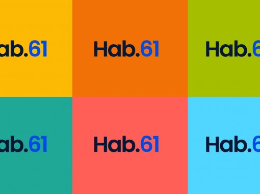
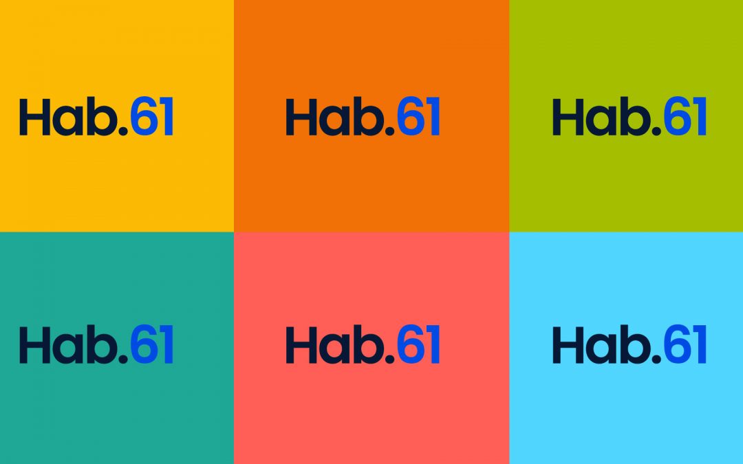
The new visual identity of ‘Habitación 61’ incorporates a vibrant color palette that reinforces the idea of diversity and freshness. Each color is associated with a content category, facilitating navigation and quick understanding of the topics covered. The logo has also been updated, opting for a more modern and elegant typography that maintains simplicity while providing a renewed character. The integration of circles as a graphic element reinforces the connection with the community and the exchange of ideas.
An abbreviated version for greater adaptability
The choice of colors in the new ‘Habitación 61’ image focuses on bright, contrasting tones, such as deep blue, bright green, and warm yellow, which not only differentiate the categories but also convey energy and renewal. The sans-serif typography used in the new identity is more stylized and legible, reflecting the blog’s focus on content clarity and access to practical information. This combination of elements provides a digital, modern, and professional image that invites readers to explore every corner of the blog.
by Sextaplanta | Agencia Digital de Turismo | Jul 7, 2026
A design that connects with nature and authenticity
Client: Cortijo San Isidro
Province: Málaga
Year: 2024
The brand design for Cortijo San Isidro is inspired by nature, featuring organic colors and shapes that evoke the tranquility of the countryside and rural tradition. The brand is built upon a series of symbols that encapsulate the values and essence of the place. Each icon represents a key concept: the moon symbolizes the hospitality and serenity of nights at the cortijo; the sun, unique experiences under the country light; the olive leaf, the connection with nature; the hill, the traditional agriculture of the region; and the river line, the natural environment framing this peaceful space. These elements combine to convey a simple visual identity deeply connected to its surroundings.
Simplicity and rural connection reflected in every stroke
The brand design for Cortijo San Isidro is inspired by simplicity and a deep connection with nature and rural life. Every stroke and every symbol—from the moon to the olive leaf—reflects the values of hospitality, serenity, and authenticity that characterize the cortijo. This visual identity, with a soft color palette and organic shapes, seeks to convey a genuine experience of connection with the rural environment.
Cortijo San Isidro: where tradition meets modern design
Cortijo San Isidro’s visual identity aims to merge tradition and modernity. Inspired by the nature and essence of the Andalusian countryside, each brand symbol reflects an aspect of rural life: the sun, the moon, agriculture, and the landscape. This approach is combined with a clean, modern design that uses simple lines and a soft color palette, creating a brand that honors its traditional roots while projecting into the future with a contemporary style.
by Sextaplanta | Agencia Digital de Turismo | Jul 7, 2026
Don’t cancel, postpone: a collective solidarity initiative
Client: —
Province: —
Year: 2020
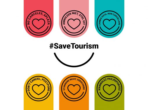
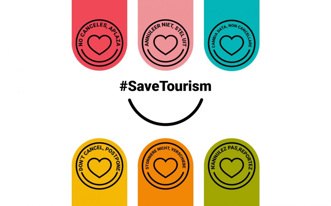
The idea for the ‘Don’t Cancel, Postpone’ campaign originated at Sextaplanta as a direct response to the devastating impact that the Covid-19 pandemic had on the tourism sector. Inspired by solidarity and collective support, this initiative sought to encourage travelers not to cancel their plans, but to postpone them, as a way to help tourism companies survive during the months of inactivity. The heart was used as a universal symbol of support and empathy, while the clear and direct message appealed to responsibility and commitment to the sector.
Simplicity that connects, support that transcends borders
The graphic design of the campaign was based on simplicity and visual clarity to ensure rapid understanding of the message. Vibrant colors were used to capture attention, while the heart icon represents empathy and solidarity toward the tourism sector. The design is consistent across all languages, with slight chromatic variations for each, reinforcing the international reach of the campaign. This visual uniformity helps strengthen the campaign’s identity and makes it recognizable in any context.
On social media, many companies echoed the message and created their own adaptations of the design, tailoring it to their websites, social profiles, and even their specific type of business.
Design of a voucher for postponing bookings
The action was linked to the gesture of travelers, accommodations, and other tourism service companies reaching an agreement to postpone bookings without a time limit. For those establishments that did not have a sophisticated booking management system, we designed a very simple document to issue booking vouchers to manage these postponements.